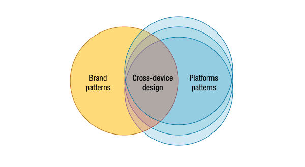
Designing across multiple devices is hard. Very hard. The reason is that you have to strike a balance between:
- The platform patterns, in order to make the app feel right in the context
- The brand/service patterns, in order to make the users at ease regardless of the device they use to access the service
Twitter launched today a redesigned app for Android and iOS, and while they might have a good reason for this, they broke a consistent and solid design they had in place.

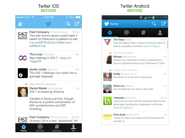
As you can see before they had that balance perfectly:
- The color and logo usage was consistent.
- The toolbars follow different platform standards on iOS7 and Android, but the elements are in the same position across them (search, new tweet).
- The tabs follow again the different platform standards, one at the bottom and one at the top, but they use the same iconography, color, order and information architecture.
So, before Twitter was an excellent example of this balancing act of creating a solid experience across device.

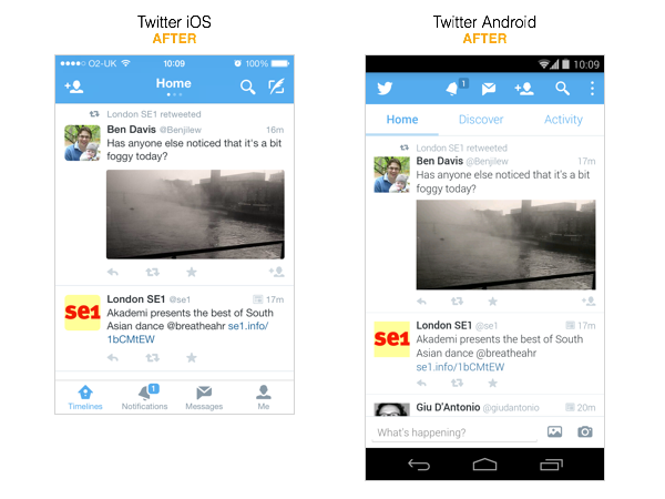
Today’s redesign broke it entirely:
- The color and usage is still consistent, but…
- On Android it removed the tabs to navigate, entirely. The functionalities achieved by the tabs on iOS are now partially on the toolbar at the top… so that’s disrupted as well, breaking again cross-device consistency.
- Even worse, Android’s version replaced in the same position of the tabs a sub-navigation that looks like a tabbed navigation but it does a different action, it’s just a switch between the different timelines.
- At least, the gesture to switch them is consistent (you just swipe the timeline).
- Even creating a new message has moved, now explicitly open on Android, while still triggered by an icon on iOS (notice that there’s no advantage in this, since the same action, a single touch, is the only thing required to write a tweet).
Notice that the new apps aren’t more or less consistent from the platform perspective, they both use the same OS patterns, but they break their internal brand consistency. Now a user that uses both iOS and Android will be constantly confused.
—
To quote the presentation Andrei Herasimchuk did at Frontiers of Interaction 2011:
In order to design digital products across multiple devices successfully, one must define these core pieces first:
1. content
2. behavior
3. aesthetic
In other terms, to design across devices you need to be aware of the platform patterns as well as the brand patterns (and in brand I include also interaction patterns, service, and so on). The intersection of these creates the correct design solution.
