This pattern is an interesting one. It didn’t appear as a jump ahead that was designed at some point and then spread to more and more websites, like it happened for the mega menu pattern. It’s more an evolution of the existing standard website headers around a need that got understood better. Spaces got thinner, search boxes got widely accepted and collapsed, positions got repeated over and over, website after website.
Characteristics of the Master Bar
The master bar is an interactive element that sits at the top of the page and act as a top level navigation item.
It seems evolved from a compression and simplification of the usual navigation headers, reducing them to a minimal set of components that deliver most of the value for the end user. In some situations this approach leads even to a look that is more similar to desktop applications, like Twitter or GitHub, while other keep the traditional web look, like Quora or Mashable.
There are in my opinion three reasons behind the evolution of this pattern.
- The interfaces are getting simpler and more result-oriented. Complex navigations take more space out of the page and are often an expression of a lack of focus and understanding of the final user needs. With more and more companies and services adopting more user-centered approaches this simplification often comes natural.
- The browsers got simpler and simpler and the ugly and crowded toolbars started to disappear in favor of a lightweight frame. The visual result is less clutter in the top part of the screen, allowing a toolbar-like element in the website to stand out more clearly.
- Many of the most popular websites adopted this pattern due to its effectiveness, helping it to spread. Think of it: both Facebook and Twitter, with variations, are using this approach.
In general terms, the master bar pattern has these traits:
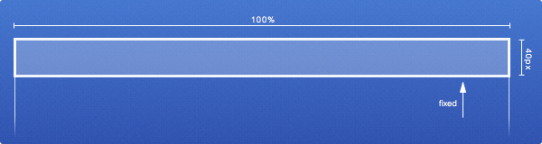
- Its positioning is fixed, stays visible while the page scrolls
- Its height is around 40px, full width
- Contains usually: logo, menu, search, and user info
- It usually have contrasting style, differentiating itself from the rest of the page
- It has a notification system built in, often in the user info area.
While of course not every master bar out there strictly adhere to these traits, this quick list is useful to outline them and it’s even more useful when you have to design your own.
The elements
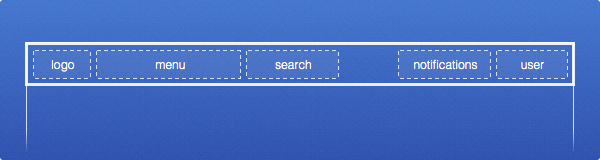
The logo is usually ad the very right of the bar and if the brand image of the company is strong, can be used just the logo without the text. Twitter and Nike are a good example of this.
The menu is usually made of 3 to 5 items, leaning more toward having just three of them. This approach leads to radically different information architectures of the websites, and require usually a good pairing with a rich footer that acts almost like a sitemap.
The search area can be a text box containing a text like “Search…” or just the usual lens icon. When in box form, it should be usually complemented by a rich, inline search feature. When it’s a lens, it should trigger an in-page box, without loading a separate page (but the separate page must still exists for accessibility reasons).
The user area is often made of a combination of name and avatar (sometimes just one of the two) and can either lead directly to the user page or open a dropdown with user-related options (account, settings, logout, …).
The notifications area is very important, even if often it’s blended with the user area. It’s clearly one of the items that lean more toward the tool usage of the master bar, but it’s also an important element for any updating website, because the users now expect to be notified there if there are updates. This item is the most important complement to activity streams, because it conveys the notifications that require direct response from the user.
Why it’s good
There are various reason why the master bar pattern is a good improvement.
- It’s good for the user, because it allows a simpler navigation and provides an element that is present across the whole website.
- It’s good for the brand, because while the logo is smaller, it’s constantly present even when the page scrolls.
- It’s good for the designer, because it forces a page architecture with fewer elements, more focused around the needs of the user. Fewer elements means a harder choice but also an improved effectiveness around the core features of the website.
A slightly different approach to logo placement
The effective way to use your logo in a master bar pattern is slightly different from the norm. The reason is the dual effect of:
- having the bar always present, regardless of the scroll position, making the logo omnipresent
- having the space dedicated to the logo being inherently smaller (since the master bar is usually 40px high).
The gain however is usually on the company side, because the lost visibility due to the size of the logo is usually balanced by its continuous and reliable presence. It becomes more like the car emblem: it’s there, right at the center of the car, but the percentage of space it takes is minimal compared to the total screen estate.
Overall, I also think that the obsession about “the big logo” is disappearing and now there’s a more pragmatic and result-centered approach to branding.
When to use it
The master bar is an interesting solution, but clearly can’t be used in all situations. It’s not effective for pure communications websites and doesn’t work for showcases or similar activities.
It’s instead very effective in situations where the functionalities provided by the website are tool-like. Think about Twitter: it’s a communication and a news website for many aspects, but the user will keep it open, refreshing and interacting like it’s a mail desktop application.
Intranets for example are an excellent candidate for this approach, because these are meant to be repositories of information and spaces for continued interaction between people and as such are more akin to communication tools.