In Automattic we often run Design Challenges, which are quick sprints where designers and non designers brainstorm concepts independently in order to explore more different approaches before proceeding.
The design challenge usually run as follow:
- The designer looking for concepts and explorations posts a new design challenge, containing some research data, the outline of the feature or the problem, and the goal it satisfies. This post has to be as complete as possible without being too long.
- Whoever wants to participate has usually a week or so to think ideas and prepare concepts. These can be very detailed or just raw ideas. They can be done in prototypes, high fidelity mockups or just sketches on paper.
- On a specific date, everyone posts their concepts describing the reasoning behind them.
- The designer now has from a few to many exploration to integrate their ideas and the research they have.
It’s important to notice that these challenges are then material for the designers working on a specific feature, they aren’t meant to be built “as-is” since often they lack the complete understanding of the issue. It’s a sort of in-depth brainstorming to support the designer leading that feature, not a complete concept – even if it might look complete.
Last year we ran a challenge trying to explore new approaches on how a future customization experience could have worked. We stopped working internally as this became the work for WordPress in 2017 (editing and customization experience) but the concepts might still be relevant for discussion and brainstorming.
The concept foundation
The starting point has been: “What if we didn’t have the constraints we have today in WordPress to build a site?”. I reviewed both plugins for WordPress, as well as competitors, and I reached one conclusion: everyone is still tied, either for technical reasons or for mindset, to paradigms that have been already explored elsewhere in detail. The web is often trying to reinvent the wheel, but that wheel has already decades of design work before WordPress was even committed to a repository. Namely: desktop applications.
A cross analysis between web and desktop highlights in my view that many problems have already been solved in terms of general UI flows. Even more, every desktop application that does some level of design converged on a layout that has an inspector: Keynote, Photoshop, Pages, Sketch, and so on. Which means that as much as the WordPress “customizer” receives a bad name, we shouldn’t throw away the good things it already does: the fact it is a sidebar isn’t the problem.
Another aspects where web apps fail often is the confusion between the editing moment (there’s an object, I want to change it) and the insertion moment (I want to add something to the page). Desktop apps have the two clearly split most of the times, often inserting in the top or left bar, and properties in the right sidebar.
I also don’t believe that overlaying bars dynamically is ideal, with the exception of very minor things. The reasons being that their position is unpredictable (where should I look?) and that they also cover content, which is directly against the idea of a WYSIWYG editor. There’s a reason why Photoshop moved away from floating palettes by default and Sketch has none.
The principles are thus:
- Borrow from more mature apps — desktop.
- Direct manipulation — with awareness of HTML constraints.
- Interfaces for Insert and Editing are clear and separate.
- Block top architecture — with a twist.
- Pages are the backbone of the site. Posts are just special cases.
Assumed layout/theme engine
To design a site builder is necessary to not be too detached by what’s possible and necessary with HTML (text re-flow based, responsive, etc).
This site builder concept assumes the following logic behind the scenes:
- The page is a huge single column.
- Columns contain elements (blocks, widgets, call them as you like…).
- Special elements are column elements that can split columns in multiples (2, 3, 4+).
- These column elements can be nested: a column can have a text element, followed by an image element, followed by a column element that splits that column in three sub-columns.
- There’s some boilerplate CSS behind the scenes that manages the column logic independently of “themes”, and CSS specific for “themes” that style them in unique ways as necessary
Site Builder Concept “Parrot”
This concept is direct-manipulation based, with every UI element always appearing in a fixed sidebar. The information architecture is as follow.
Two edit “modes”:
- Design mode view — this is where blocks are edited, added, and the style is changed. Page templates can be created from here too.
- Write mode view — this is a pure writing view, optimized for even complex editing flows, and immersive.
And the following top level sidebar states:
- Pages — controlling the whole site page architecture. It also allows switching the site builder from editing one page to another.
- Properties — when an element on the page is clicked, the sidebar shows all the controls that can edit that element.
- Insert — all the elements that can be added to the currently viewed page.
- Details — (visible only in Write mode) shows the metadata of the post or page the user is viewing, if any.
- Publish — once everything is done, the user can choose to simply save the changes and come back later, or publish the changes to go live.

Some highlights:
(A) Navigation / Information Architecture


This was probably the most difficult bit, as the various pieces are to some extent transversal to each other, non homogeneous. I put the switched between view modes (design, write) at the bottom, so they are always present but not overwhelming, and at the same time I kept the top navigation straightforward with the main actions.
Selecting an element on the page acts as an “invisible” sidebar state, thus all the top items get unselected.
These pieces are very important, and even if I think I found a good balance in this design, there are still aspects that are challenging, for example using just icons for the mode switch between buinding and editing.
(B) Templates
 As the site builder creates a layout from the ground up, templates are now full page layouts, that simply save a specific configuration of elements on the page, without content.
Some are theme-specific, some are user-created.
(C) Pages as backbone of a site

WordPress was born as blogging engine, so obviously “pages” were a secondary concept. However, sites are designed with a page structure in place, and only then a few of these pages are specialized for posts, news, and announcements. Pages are the backbone (in design terms they map directly to the information architecture), as such they represent the top level element of sites.
The homepage is the only page that can’t be removed.
(D) Posts are special types of pages

A special kind of page can be added, which is the posts list, which is a series of blocks that show the list, and also allow managing them. I didn’t dive too deep in here, as I’d expect to keep the posting flow outside of here, however, I’m also sure that could be converged here too.
This concept is probably very difficult and will require a lot of iterations to get it right.
(E) Direct manipulation controls

This is the most difficult bit, because HTML pages respect a core model which is based on the “flow” of text. As such, directly placing and sizing elements on the page incur in the risk of breaking everything: there needs to be some degree of control structure.
The idea here is to highlight the element (that’s a double border which has a dashed white line and a dashed black line together, so contrast is insured) however the positioning is controlled through margins and paddings. The top/bottom arrows instead allow for the element to be quickly moved up and down in the same column, respecting the HTML flow logic.
(F) Insertion

Insertion happens by drag’n’drop on desktop, and tap’n’place on mobile (while this concept doesn’t show mobile, it was considered while building this: in this case the sidebar inspector acts as a modal overlay on mobile).
Simple. Effective. And with accordions that panel can scale to many different blocks. We could also add search. Insertion happens exclusively through this sidebar panel. Clear and simple.
(G) Publishing

Saving changes is automatic, and happens instantly and seamlessly. The “changed” version is always stored, and that can be published at any time. We can evolve this further to be more granular about multi-user edit, but I think this already can be very powerful.
Revision history on “Publish” might seem odd, however, it makes it highly discoverable: once you publish once, you know where it is. And if it’s not needed, it can be just folded away with the chevron icon.
The addition of changes summary at page and element level can be also very very powerful for bigger sites, and more complex businesses and changes.
Editor / Write Mode
What’s write mode? Complex sites, magazines, high traffic sites, editorial flow, would find very very hard to use a pure site editing experience for writing too. They are focused on content, and as such that’s where the focus should be.
The idea of write mode came out from a discussion with Joen Asmussen, which at some point during our customization related discussions said:
write the post in the editor using the created template and fill in those blocks
This concept does exactly this. The design mode toggles to write mode, and write mode lays out all the “content” blocks on that page in a way that is instead editor, author, writer focused. It’s an immersive view for editorial flows. I feel this could be very powerful, and the connection point that joins people that want the editor, and people that want a site builder. Why not both? — with the right architecture.
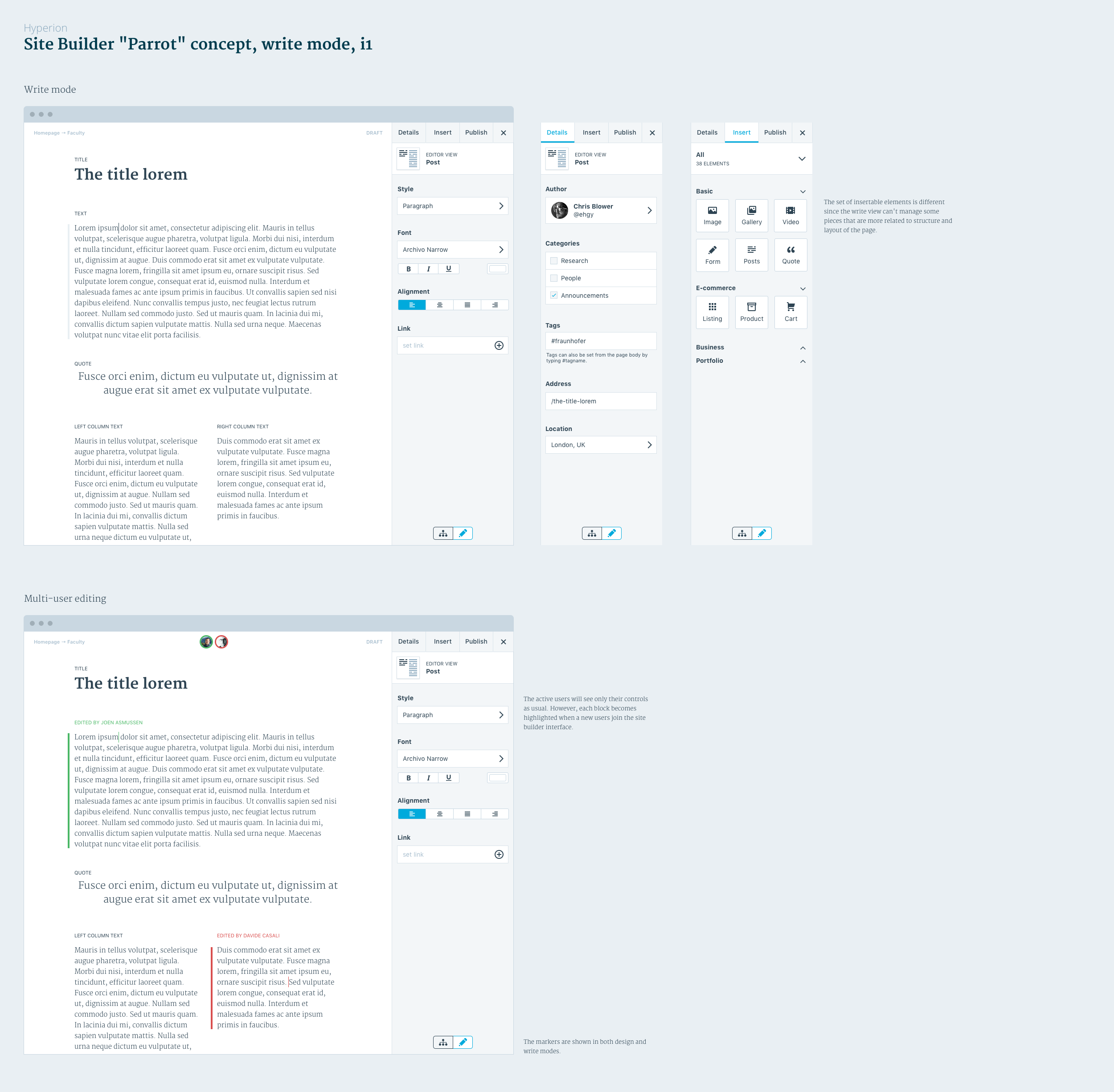
(H) Editor areas

These are all the areas that have been inserted in design mode, surfaced as pure text.
Note that the columns are preserved: the combination of columns elements and other elements as the layout engine makes this possible. New elements added here (a subset is available) are mirrored in the design view too.
(J) Collaborative editing

When another user joins editing that page, and starts editing an element, it’s marked. This allows both block-level lock, as well as in the future full editing capabilities.
Big kudos to Joen Asmussen again for the discussions behind this one, it’s basically his idea.
This mockup might feel complete, but it’s not. It’s exhaustive as I tried to pull together a lot of different and challenging ideas, but there are still parts that are fairly lacking polish if not they are very hard to understand and need to be changed drastically.
However, you can borrow ideas freely. This design is as open source as WordPress.
Thanks to Mel Choyce, Joen Asmussen, Matías Ventura, Weston Ruter, Nick Halsey, Ian Stewart, Tammie Lister, Andrew Duthie, Matt Wiebe, Payton Swick and all the people that inspired this concept with discussions, feedbacks, and ideas.