Pretty much each and every website has at least one landing page. In traditional terms, that can be the homepage of the site, but of course that’s just one of the potential many that you could have.
In my design and advisor role over the year I found that “make the landing page” is one of the most difficult topics, very opinionated, sometimes treated as a science, some other as an art, and also one of the very first that any startup will find in their progress: what needs to be there?
This article describes a skeleton, a starting point for your design iterations. The idea is to provide the first step out of many to come: while you can do much much more than this (likely through iterations, tests with users, funnel analysis, A/B tests, and so on) you shouldn’t do in a sense anything less than this — or if you do, you have to think more than twice about the choice you’re making.
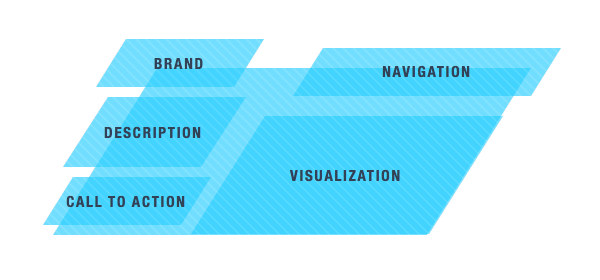
The landing page skeleton at its core has five elements:
- a branding element — i.e. the logo
- a descriptive element — i.e. a title and a description
- a call to action — i.e. a button
- a visualization — i.e. a screenshot, video or mood image
- a navigation element — i.e. a menu
Even just from this initial description you’ll notice that many of tbe top companies in the world, startups, sites, professionals all follow in one way or another this skeleton, and when they don’t, they have a very solid reason for that, like e-commerces which tend to express the elements above just by showing already the tool itself: the products they offer (which btw it’s a great practice overall, the barrier to entry is zero, but this is an entirely different topic).
Let’s dive a little more in detail.
1. Branding Element
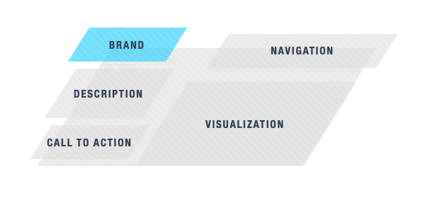
Discussing branding properly requires probably an entire article or even a book just for that, and the reason is that design a brand strategy is a big topic by itself. Many people reduce that discussion to “the logo”, but let’s be clear here that the logo is just one of the pieces of a brand, not the first, not the last: I can show you a Coca Cola product without the Coca Cola mark on it and you’ll still get it’s Coca Cola.
The short story is: your entire page should tell your story, not just the logo.
So yes, place the logo and the name clearly and correctly on the page, but understand that the entire page needs to communicate, even without logo and name.
I’ll give you an intersting example: GitHub is an incredibly strong company right now, but their branding is in a sense very poor: if you go to their homepage and change the GitHub name with anything else, it looks like a generic web app. There’s nothing there that tells you it’s GitHub but the logo.
…or maybe not. Because GitHub positions itself as a pure tool, something that you can get in your business swiftly and smoothly and as such, it might have been a brilliant idea to be absolutely generic. They don’t push their brand to you – they do that in different, more subtle, ways.
GitHub is an edge case on this, clearly. But shows how a brand strategy goes way beyond the logo and even the page itself if done properly.
2. Descriptive Element
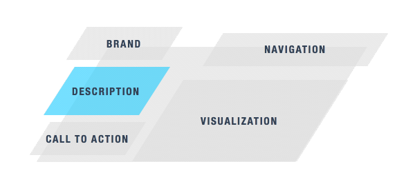
This is probably the most challenging one, because you have to reduce all your service, product or business to just a few words. This exercise goes way beyond the landing page itself: it’s an exercise in focus. It tells you how much you understand of your own product. It forces you to highlight the value you’re giving back to your users. Every single word there should be weighted.
In my project initiation workshop I do explicitly an exercise called “One Sentence” exactly for this reason. Forces everyone to really know what they are doing. The same applies here.
If you can’t reduce your business to a single short sentence you need to do more work in both focus and communication.
The form I use often in the descriptive element is split in basically two parts:
- A title, the short sentence I described above.
- A description, no longer than a short paragraph, usually 2-3 lines.
This structure helps a lot because the title defines who you are and why. The description instead can give you enough space to describe the solution and be more pragmatic.
3. Call To Action
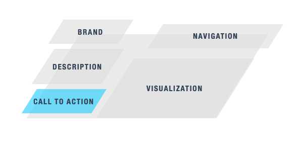
This is probably a very abused word, but the reason is that it’s the key to get people in. It’s an element on the page that the user will have to take an action on. Can be something like “enter your email” or “type your website address”, but in its simples form it’s just a button.
And most of the time a button performs really well… if you know how to design it.
To design a call to action button you should think around these two constraints:
- Imagine that the button is the ONLY thing on the page.
- You can just use about two words: a verb, and a subject.
Of course, the text can be longer, but overall should be so short you could read it in as few saccades as possible. Should be “at a glance” readings.
Depends on the kind of service, but great call to actions can be:
- Create your site
- Register domain
- Find friends
- Top up
And even the more boring:
- Contact us
4. Visualization
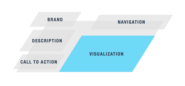
This is a difficult one because has a lot of variance and there are lots of solutions that could work. Some researches point out that putting a video there will raise conversions, but as often happens: it depends and you should test it.
But regardless, a lots of products out there would benefit a lot even just by a single screenshot of the tool. A screenshot that opens a video even more. Show me your goods: seeing fresh apples is way more appealing than a test telling me “fresh apples”.
This also tells me another thing: how confident are you in the simplicity of your design? How clear is that one screen of your service? I found that in the end the reason why many companies don’t put a screenshot there is because not even them like their design (this happens with older companies, less so with startups).
Note however that I’m not saying that has to be a screenshot. Again depending on the brand, product or serviceyou might be better of with a smiling person, a group of people enjoying themselves, a seaside view and so on. Just be sure to not do that because it’s a nice photo, but because it really tells a story about your brand.
5. Navigation Element
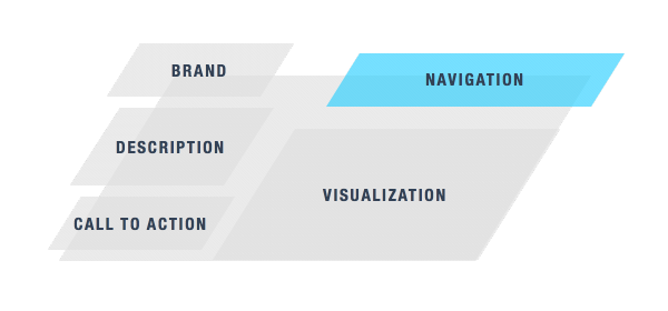
Here we are really talking about a menu. There might be alternative ways, but a menu is such an incredibly powerful tool that it’s effective almost all of the times.
To be clear: a well done menu can by itself communicate enough about your company and offering more than any copy on the page. Great information architectures do this.
Imagine a menu that says:
- Dresses
- Shoes
- Accessories
- Lingerie
- Coats
- Swimsuits
And another that says:
- About
- Our Offering
- Philosophy
- Portfolio
- Sustainability
- Blog
And another again:
- About
- Blog
- GitHub
- Contact me
Even without anything else, you already get what the three sites above are about. While they could all be more specific (I can’t be more specific going abstract, by definition) they all already tell a story.
This also tells how stupid are these sites that fold menus under a “Menu” button (or even worse, just the hamburger icon). While that could be done in certain edge scenarios, you’re losing not just a powerful communication tool, but you’re also saying that you don’t want people to orient themselves with that. Which then tells me you don’t have a proper information architecture at all (again, not always, but most of the times).
So: please consider your menu not just from an architecture and content strategy perspective, but also from a pure communication perspective. Menus tell stories.
Let me close with a note…
A Note On Famous Brands
Famous brands can completely ignore this skeleton without any problem, because people already know everything about them. This is important to understand because I found myself in practice to see people validating their home page design saying things like “Facebook does that”, which is completely pointless. The moment you have the brand recognition, spread, and ecosystem Facebook has, then you can copy their homepage. Not before.
···
Start from this skeleton and then iterate and test the hell out of it to get to a point where you’re comfortable and you have something that leads to a funnel that converts well. And after that start thinking about multiple entry points, multiple landing pages, and expand your strategy. Iterate, iterate, iterate.