While the new visual style of iOS7 is truly Apple in its conception, many people felt surprised by it, and some aren’t that happy – with the icons taking the biggest share of criticism.
I want to take this very high-profile example because I think it’s an excellent case study of a brand strategy and design strategy. I won’t comment on features, but on the choices that led to the visual style that we have seen in the iOS7 presentation.
The space of visual choices is, at any point in time, both unlimited and limited. It’s limited because we start surely from the immense amount of possibilities and combinations, but then we need to fit that inside the various constraints of a proper style, the current zeitgeist, the company strategy, the situation of the market and the kind of brand that it’s going to represent, in contrast with the competition. This means that we aren’t free. The best designers understand and execute within this set of constraints. Usually the less experienced the designer, the less these constraints are understood and we see as a result wonderful designs, but totally out of brief.
The starting point to understand the iOS7 visual style is to understand Apple’s position today, and its competitors.

Google is going toward simple and flat solutions: the use of cards, flattened styles, sharp edges, barely visible shadows, slightly smooth corners, light grays, and very colorful and playful imagery and icons.
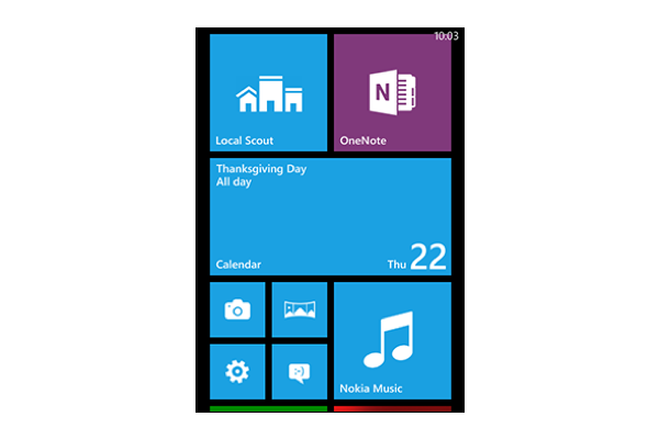
Microsoft has taken the criticism of the past decade to heart and has done the most extreme stylistic simplification possible: squares, colors and monochrome icons. From a pure visual perspective, you can’t be flatter than that. Even their new logo is four flat squares.
Will I include Samsung? No. Samsung doesn’t have a clear branding strategy. Not at all. They lack consistency, structure, and vision. So, they aren’t playing this game. They are playing well other games, but not this one.
—
By now, you see the problem clearly. The first iOS style existed to bridge the perceptive gap of a device that was, inherently, a flat surface. The UI had to convey the meaning, the new world of possibilities. So, simplicity for Apple at that point meant taking some clues from OSX and building a clear style. Let’s forget for a second the extremes of corintian leather: if we think about simple materials in real life we think of glass and aluminium. This describes perfectly the foundation of iOS until version 6. It’s a simplicity not in execution, but in the conveyed perception of the material. Simple as glass.
But iOS now felt old. And I mean mostly old compared to the competition. Where to go, though? Microsoft stole the extreme of simple-as-flat. Google stole the extreme for simple-as-light-and-soft. Apple had to move away from the simple-as-materials.
Where to go?
Let’s review for a second Apple’s core brand aestehtics for iOS:
- Simplicity, purity
- Rounded app icons
- A set of interactions (sliding items, bounce scroll, …)
The first element comes from Apple’s core value. The second element is the most important part of their mobile brand (you can read more about it here). The third element is a part of their experiential design language.
The solution you see today is the only one that would have allowed iOS7 to retain the core Apple values while refreshing the style entirely. I predicted exactly this in a tweet a few weeks ago:
My guess for the rumoured new graphic style for iOS7: see the menu bar on Mac.
— Erin ‘Folletto’ Casali (@Folletto) May 24, 2013
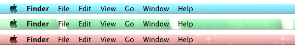
If you notice, the OSX menu bar has all the necessary elements. Let’s disassemble it:
- simple, very simple
- light shading, not entirely flat
- typography based, but with added basic icons
- slight transparency over any background, picking up the color and adding blur
And most importantly: inherently Apple, keeping it consistent with OSX. The four point above describe exactly the direction Apple went for iOS7, pushing maybe even more on the whiteness of the interface (did you notice how light it is?).
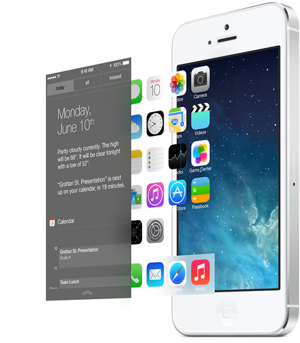
More importantly, design is how it works. That’s why the new style isn’t just applied as a bland visual refresh, but it’s baked in deeply in the system. Every interaction plays with the system of blurs and fades. And it also enforces the understanding of multiple layers, one on top of the other. Is it flat? Apple’s message is: “not really: it’s simple and deep”. There are layers. There is a reality of content (data, graphics, images) behind its flatness. This is the message.
In the end, Apple went in pretty much the only possible direction to keep the brand consistent, building on its own assets and at the same time creating a fresh and up-to-date style.
You might not like it, but it’s perfectly aligned with Apple’s heart.