In the meantime of the logo and the identity study, I was thinking also about the website. The website – this one – is in fact the first application of the new coordinated personal identity.
Process
I’ll be back on this topic.
As any good project, I’ve started thinking about what should be the best, leaner and simpler process that I should have followed. I came up with this one, loosely on the lines of The Elements of User Experience:
- Define the objectives
- Find and analyze good solutions, good designs and best practices
- Define the user experience — UX Design
- Define the information architecture — IA Design
- Define the interaction model — Interaction Design
- Define the graphic layout — Graphic Design
- Learn/update to the state of the art development techs
- Develop
To support this I created a checklist. First on paper, then on Things. (but also The Hit List or paper again are good alternatives).
It’s of course a simplification: all those phases aren’t sequential (argh!) and aren’t separated, and some of you might also argue that interaction design is a part of user experience design, etc. This isn’t an essay on the One True Mighty Process, but a small analysis on how even a simple thing like this can – and should – have all those pieces, and for a good reason.
Objectives
At first I thought that the objective was just to show some skills within the design itself, but soon after I told myself that it would be pretty stupid, so I defined a more detailed outline:
- Identity: build a space to be more “mine”
- Discussion: build a space to show and discuss ideas
- Process: build a structure that allows both rich articles and small notes
The objectives are in order by priority, and to tell the truth even at this time, writing this article, this list still makes me think (is it right? I’m sure? too much? not enough?).
There’s also a third point, but it’s more about content than an objective by itself: it’s spreading knowledge. If I feel good in something, I love to teach it. I think also that in any good teaching process the speaker receives something valuable. ;)
Not everything is measurable, but I think that it’s important to try defining some kind of metrics to be checked. I’ve defined a few simple ones:
- Views and pages/visit
- Discussions with interesting people (comments, mail, twitter, whatever)
— R. Pirsig
The term of paragon is my previous blog, of course. In a broader sense, everything should be observed and analyzed. Metrics are just a simple and straightforward way to do that. Also, I don’t want any kind of advertisement: I’m not interested on money. I’m interested in quality. Quality can’t be intrinsically measured.
Find and analyze
Now that I knew what I wanted, it was time to find good solutions and good designs. I wanted something simple but powerful and the first one that came in my mind was – and still is – Daring Fireball:
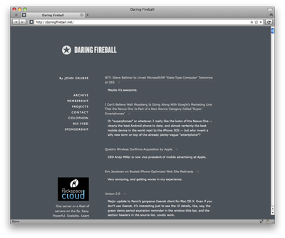
It is simple, clean, very content-oriented but without killing the freedom of handling additional content. At it has a great brand identity. Also, every technical detail, if present, is well implemented.
Of course, one example isn’t enough, so in a few month I’ve collected many websites that in a way or another interested me.
I choose them for many reasons: layout, aesthetic, content, architecture, technical details. I was gathering every possible interesting idea in order to make a synthesis from them.
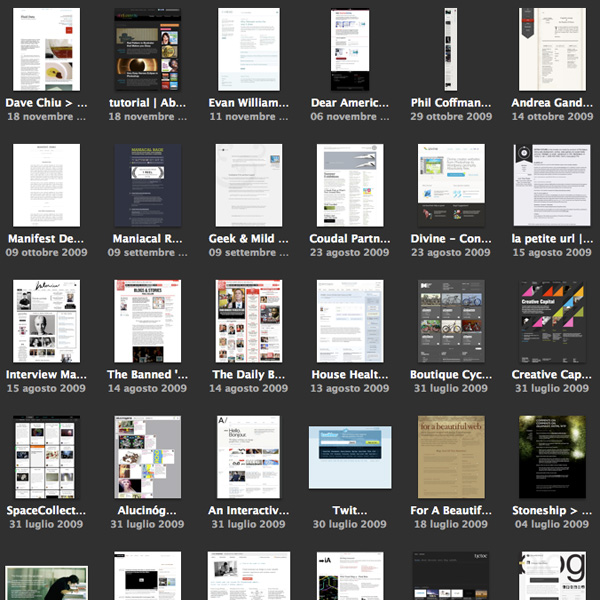
There are many interesting things: I liked the redesign cleanness of Evan Williams‘ blog by Vitor Lourenço, the free form of Dustin Curtis‘ pages, the physical feeling of the paper of Andrea Gandino, the amazing elegance and cleanness of Sean Sperte’s Geek & Mild, the typographic attention of John Boardley’s ILoveTypography, the layout structure of Area17 and iA, the simplicity and communication directness of Sofa, and so on.
I’ve analyzed them, reduced them, taken all the things I thought were interesting and checked they could work in some way together.
User Experience Design
I know quite well how users navigate inside many kinds of web sites, and I know it better inside my websites – even if in this case the numbers probably aren’t high enough to be statistically significant.
I chose to optimize four flows:
- Homepage flow: blog homepages are often dull, while news websites are often driven by the attract-attention plus make-pageview pattern, that I don’t think it’s good for a quality-aimed website. I wanted to make the user able to get a global idea of all the content from the homepage and be at the distance of one (or two) clicks from the content itself.
- Reading flow: I wanted the single article page to stand as a standalone document, without anything distracting the reader or luring it into making another click or discovering more. It’s the single content by itself should drive the reader to the bottom.
- Discussion flow: the comment part is often something “attached” at the end of the post, in a way that makes it an appendix of the article. I wanted something that was clearly a comment, but that was also able to go on with the reading, like a text build by many hands. I wanted to make it a first class citizen in the page.
- Discovery flow: I wanted to make the content discoverable without interrupting the reader. So the discovery of other content should be in specific points: at the end of the article, in the home page and in the menu. Nothing more than this.
Let’s not forget the other side of the website, often neglected:
- Writing flow: I wanted to be able to add both long and detailed articles (such as this one) and short quotes and comments. I’m convinced that lowering the barrier to writing something is critical and that isn’t just a matter of usability, but also of mood. The way you think about your blog auto-selects the content you’ll write on it.
I also decided that I should start with a website a bit less “social” than I thought it would be. Maybe in the future I’ll add some integration with Twitter or Facebook. But I prefer to do it in small steps.
Information Architecture Design
A site like this is quite simple, but still you should think about what you really want to say and show. After a few reshuffling and analysis of what I wanted to write and how I wanted it to be displayed, I’ve defined this architecture:
- Home: the door of this website, but also the most important navigation key.
- About: the description of myself. I think this is quite important, both because it’s the first thing I read after finding an interesting blog and it helps in building a good trust relationship.
- Projects/Portfolio: a synthesis of the projects I’ve worked on, with lots of screenshots and a few insights.
- Articles: full thought out texts, like this one.
- Traces/Notes: links, comments, quotes and things I’m still thinking about.
Nothing too complex. What I find interesting and very useful are the “two ways” of writing expressed by articles and traces. I took this idea mainly from Gruber and Sperte and I think it works very well both from a reader point of view and from the writer point of view.
Interaction Design
In the various draft of all the structure above I’ve started also thinking how this could work all together. I’m a visuospatial person, so I had to visualize it on paper:
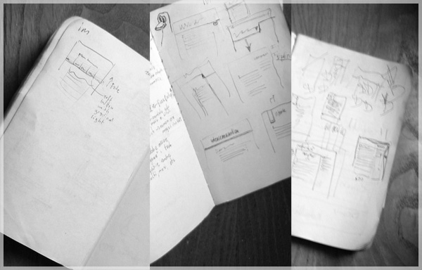
I already had an idea about the articles page from all the previous designs I made so I worked on the navigation part and the home page, the two critical parts in this project.
The most difficult part was about adding details but at the same time keeping everything clean and simple. I often reshuffled the designs after adding something because it cluttered too much the UI.
The idea of the top search dashboard came in mind just after one of those reshufflings.
At one point I noticed that I wasn’t anymore arguing about what and how the content worked on the pages, but I was thinking about the visual result. So I stopped making sketched, I took the best ones and I’ve started the graphic design phase.
Graphic Design
As I’ve already said, my first try was about learning the details of Daring Fireball and try to build upon them to make something unique.
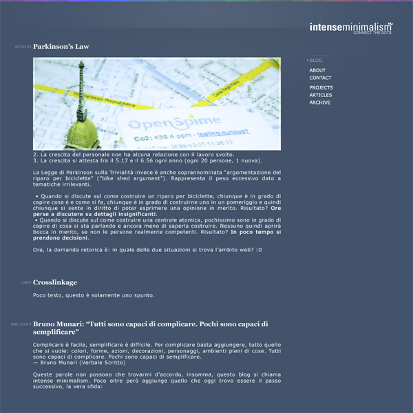
As you can see it’s not the same, but you can perceive a feeling of it (also, at this time I didn’t know yet that the blog will be just in english and the logo wasn’t finished). I choose a dark blue instead of a slightly cold dark grey and I’ve reversed the logo position in order to give more value to the content. There’s also a small shading and a small colored bar on top.
The old images would have fit well also on a dark background (thanks to the alpha border I used), that was nice.
But as much as I like contrasts, dark isn’t really for me: I think it’s cool for a while, but in the end it doesn’t work out. I already went through this a few times. I tried on an inverted version of this layout (with white background) but it wasn’t as good as this one.
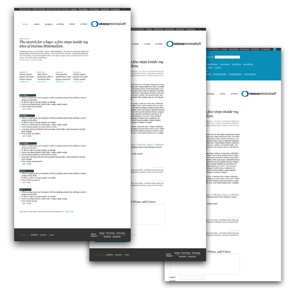
In the meantime I completed the logo so I started over and after a few iterations and some feedback I came up with the final layout.
Development
I’ve decided to try directly all the interesting things that I’ve seen and filtered in the last months, so I tried and then built upon some recent interesting technologies.
Crossbrowser
I usually skip past this part, since I assume that *anything* must be developed on one of the most standards compilant browsers, Firefox for me, and then tested on any other.

For this task I found very useful Internet Explorer Collection (all the IE versions installable on the same machine, from 1.0 to 8.0) with the Microsoft Internet Explorer Developer Toolbar, everything installed on a virtual machine, maybe VirtualBox.
960.gs
960.gs is an interesting approach to speed up development. The first HTML+CSS master was based upon it, but after a few checks I decided to use my own classes, incorporating the 960.gs maths I choose (39px column, 12px gap): I didn’t use the standard 960 grid, because I wanted a 600px wide default text column.
For me 960.gs is interesting but I think that a similar logic is intrinsically behind the best layouts, using meaningful CSS rules instead of “columns”.
Also, I think that building the “body” of the article using a grid system could allow dynamic page layouts (like Dustin Curt’s posts, see Smashing Magazine’s article about posts visual design) with a smaller development effort. On a flexible grid-based template you’ve something like a rough version of an InDesign grid, more easily controllable than custom CSS.
I designed this blog allowing a few “exceptions” to improve the overall layout.
HTML5
I decided to try HTML5 out. The last “push” was reading the online draft of “Dive Into HTML5” by Mark Pilgrim and I noticed it was already possible to do something interesting (while, for now, I discarded CSS3 for anything with the exclusion of some minor features).
I don’t like the workarounds to use the new tags on Internet Explorer *sigh* (it’s JavaScript based) so I worked on a CSS that uses both tag declarations and class/id declarations (something like: “article h1, .article h1”). Using those “double declarations” I could switch quite easily between “<article>” and “<div class=”article”>” without rewriting any CSS rule.
I’ve validated the code using html5.validator.nu and the structure using the html5 outliner (thanks Matteo).
I’m still not sure on real-life usage of some tags, but I think I did a good guess with this site. Let me know if you would have done something differently.
Microformats
I wanted to use more Microformats, but in the end I’ve settled on just one, a hCard in the footer. Check it with a simple bookmarklet.
jQuery
For me jQuery is the script with the best code usability around. Simple, efficient and to the point. The few JS tricks on this websites are of course jQuery powered.
Custom Plugins
To ease the usage of the additional CSS styled boxes (the one on the side and the one with the big text) I developed a small WordPress plugin, bundled with the theme, that adds two buttons on the WYSIWYG writing interface and inject some CSS in order to display it in a good way inside the editor itself.
I prepared also a print CSS, in order to show a clean and well-formatted page, without navigational elements and things completely unuseful on printed paper.
I optimized the article page in order to get the article well optimized for readability.
Optimization
I’ve optimized the page in a few ways:
- I’ve put all the javascript code in a single file. In fact I’ve just added the libraries (jQuery) on top and just after my code and the initialization code.
- When possible, I’ve used sprites in order to load more smaller images with a single HTTP request. Unfortunately it wasn’t possible to put everything on a single image – also for maintenance reasons – so at lease the icons are sprites with default and :hover states.
- I’ve used the new Google Analytics asynchronous tracking code. For now, it seems working well.
There are also some optimizations here and there, but these are the most important ones.
IE6 dying and transparent PNGs
Internet Explorer 6 is, luckily, dying. IE7 still has some issues while I didn’t have to make *any* workaround for IE8. It seems that a new era is coming. About IE6: the support will last for a while but the stats are going down:
- December 2009, worldwide:
20.99% (NetApplications)
11.44% (W3Counter)
14.04% (StatCounter) - December 2009, Italy:
7.97% (StatCounter)
My own stats are way lower, but I still wanted to give a good experience to IE6 users. So a few CSS hacks and a JavaScript library to allow transparent PNG in an easy way (Belated PNG).
Well, in synthesis, that’s all.
Any question, suggestion or hint? :)