I understand that the tablets aren’t the best selling device in the world, thus they don’t benefit from a premium treatment by companies, developers, and designers. I understand that sometimes you need to build a web app, a native app, one for each platform — this takes away a lot of time. So when iPads represent 16% of total Apple sales, the attention for this screen size is reduced, even if it’s still 2.7x times Mac sales and 18% of total PC sales.
However…
Tablets don’t get just a low priority treatment, they get most of the time utterly ignored. Because there are two basic things that can be done, really basic, that a tiny extra attention could solve:
- The portrait folding column issue
- The “mobile first” breakpoint issue
#1 The Portrait Folding Column Issue
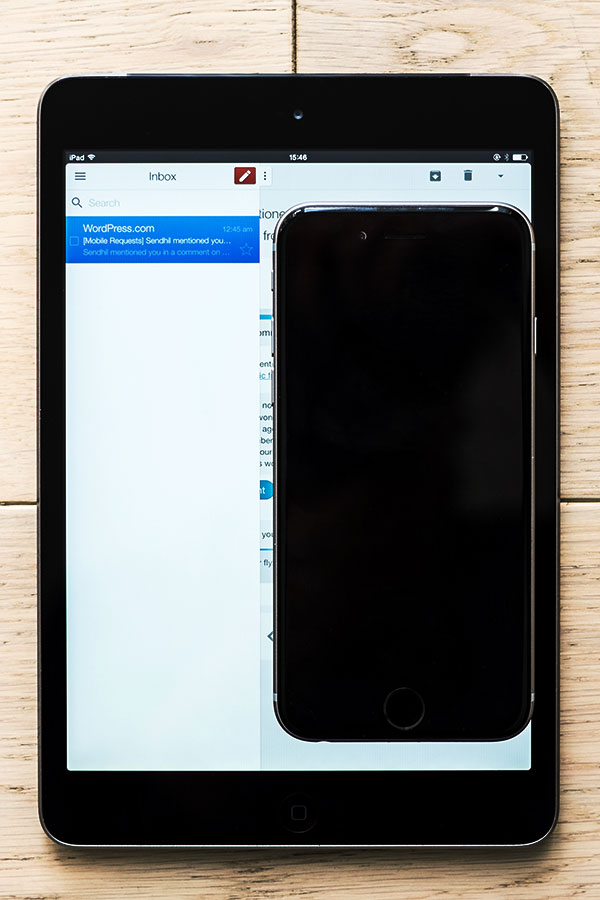
When the right column of an iPad Mini portrait fits an entire iPhone 6, how do you justify having a drawer that keeps closing anything you do, a drawer that in landscape mode is always visible?
This just means that it was actually spent more design and development time to find a solution that is meant to slow me down. I get that it’s more beautiful to read an email full screen, but when I can fit an entire phone on the right, and millions of people read on that size, well, there aren’t many excuses. Even more because it also means that you already have designed everything to fit inside that smaller space.
The default there should be a sidebar that stays there. And ok, optionally I can hide it. But that’s an extra, not the default.
Google isn’t the only one doing that, it’s just the worst offender with a tiny frustrating button to reopen the sidebar and no arrows in the full screen view to navigate up and down (something that at least Apple Mail does).
The irony? While their mail apps all have this auto-folding behaviour, none of their messaging app have this problem. Their messaging apps keep the sidebar in place, properly. Considering that their messaging apps are also the things where most of their design and development went recently, probably it means that it is also properly tested, and works well.
#2 The “Mobile First” Breakpoint Issue
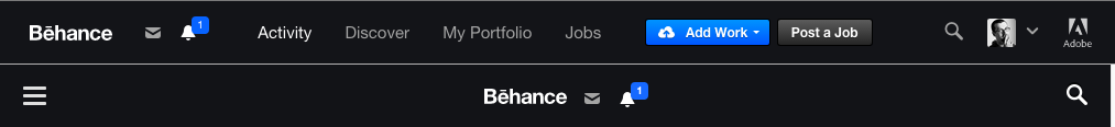
Sorry Behance, but you’re one of the best examples of this problem out there. Below 1024px the site suddenly switches to “mobile first” mode, creating large blank spaces even if the space to fit the menu is still there (and don’t get me started on the hamburger menu).
Now, 1024px isn’t anymore the standard desktop size, sure, but the problem here is the arbitrary decision that 1024 gets a worse experience even if there’s still space to fit it. Notice how one pixel less would have kept that very effective navigation on the tablets too — at least landscape.
One pixel.
I’m sure that with just a little extra time it would have been possible to keep most of the navigation there even on portrait, but at least typing 1023 instead of 1024 would have been a nice thing, don’t you think?
Please, Let’s Fix At Least These
The two changes above don’t require a huge rethinking: they are mostly due to how overlooked is the tablet format.
So:
- Let’s not auto-fold in portrait in these kinds of apps.
It would be less work to not have that auto-fold behaviour, and the column UI is basically identical to the one the app already has on mobile. - Let’s define better breakpoints.
Even just one pixel less in many cases makes the difference, and sometimes you can even make it work up to portrait.
For reference, the tablets that have the biggest market share today have:
- Landscape between 960 and 1280, so keeping a “desktop” UI until 960px would be great.
- Portrait between 600 and 800, so if you could optimize for portrait too (at least with two columns, for example) would be a great design choice.
Then sure, a little extra attention and the tablet UIs could really shine, but I get that sometimes all the time you have is just enough to change a “1024” to “1023”.
While I don’t expect the two above to be universally correct, I still think that they apply most of the time, or at the very least as a starting point.
Can we give it a try?