From an interview with Chaitanya Sareen, Microsoft’s Principal Program Manager Lead on Windows.
“This was an opportunity where you have to teach people things. There’s nothing innate about going to the top-right corner and closing something. There’s nothing innate about using Ctrl-Alt-Delete. There’s nothing innate about resizing a window. You have to learn them over time.”
This to me reads just as a bad joke. An “opportunity to teach people things” is nonsense in terms of product design. Designs lead people to learn things, but it’s a precise, definite design choice. And the examples he makes just highlight the error: Ctrl-Alt-Delete as something users should learn? Oh boy.
The problem is, for whatever reason, people didn’t want to learn this time.
“this time”
He really was quoted saying “this time”.
I’m often the one that points out that we shouldn’t jump to conclusion with the internal working of big companies because we don’t know the challenges that exists, but I have a very hard time here. These things are really design 101. You might have had thousands of reasons to get the Start button wrong, but “people didn’t want to learn” is really being miles away from the users. I’m sorry Sareen, I have nothing personal with you, but really you can’t say these things. You can’t.
Let me explain the point here, and the reason why the whole “put the Start Button back” issue is nonsense.
- Whoever decided that main, core, essential actions such “open a menu” were to be relegated as hidden interaction (move the mouse in the corner) ignored years and years of HCI practice and cognitive psychology. Never, ever, hide the main actions. Let’s say it clearly: the Start Button was a brilliant design choice, and I believe it might be superior in its concept to the OSX Dock (it could have been implemented far better, but this is an entirely different topic). There’s a reason why the Home button is the only physical navigation button on iPhone and iPad. There’s a reason why there are three buttons always visible on Android. There’s a reason why Nokia did a huge step forward in terms of interaction when introduced the single blue button below the screen (remember that?).
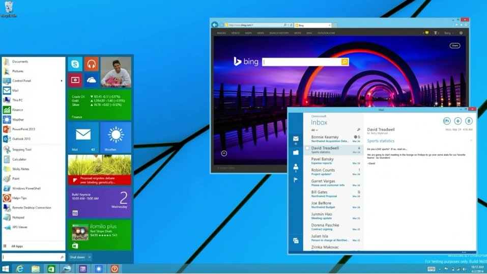
- This means that on the desktop they should have never hid the Start Button. Full stop. They could have changed it, made it more aligned with the new interaction mode. They could have made it more clear. Moved to the side. Whatever. But not hidden!
- The Modern UI of Windows 8 is the unified equivalent to the Start Menu. They do the same thing: it’s a custom list of links to applications. So they already had the answer at hand, there was nothing to change there. Just make a proper, clear, simple link that opens that view, maybe mirroring the look and feel of the physical one on black of the surface: perfectly on brand. I’m very aware that there might have been a slight disorientation between a normal Start Menu and such interface, but well, that’s where I would have worked (hello OS X Launchpad!). Instead Windows 8.1 Update 1 puts the Start Menu back as it was, with a cramped side that mirrors the tiles.
- The moment you realize that the Windows 8 tiles interface is just a rich menu to open apps, and the desktop is a container of multiple apps, you see the problem. The desktop itself can’t be “another app”. Yes, it could have been accessed the same way, but it can’t be just an app. Just check what the others successfully did: OS/2 (the same OS Windows killed by the way) used virtualization of apps inside its environment. OSX (the same OS that leapfrogged Windows years ago) used virtualization of Classic apps inside its environment. The primary thing to think was how to make an individual, old, classic, Windows XP app to run properly from the tiled, static UI. Jumping through the desktop first? That’s a workaround. To be clear: it’s a workaround that I understand, but the kind of workaround that I expected Windows 8.1 or 8.2 to fix. Not to ignore it and make then a step back.
These are the reasons why I think today’s answer from Microsoft is a step back. They have basically said “we did it wrong, let’s go back” where instead they should have said “we did it wrong, let’s move forward fixing it”. It’s lack of vision. Design by committee.
So, yes, I understand I’m outside the complexity of the decision-making process of Microsoft, and I’m very aware that there are probably lots of people from Microsoft that reading this are going to say “sure, but it wasn’t that easy”. I’m not blaming anyone. It’s culture. I understand.
What I can’t understand is the kind of answer Microsoft is giving as an explanation, from the mouth of a Principal Program Manager. Because while the issues were clear, they had two ways to interpret it: forward or backward. They choose the latter, and this makes me very sad, because I really hoped in the New Microsoft.
—
Update:
Other signs of Microsoft clearly backtracking, from this Anandtech article:
- “Traditional PCs will now boot to the desktop by default”. What was the harm in booting to Modern, since the first thing you’ll do is still opening an app, still baffles me.
- “The ability to pin Modern apps to the taskbar”. What better example of backtracking than allowing Modern apps in the old desktop instead of the other way around?