
I admit it, the name isn’t ideal but the fact that “Full to Fold and Scroll” translates to FFS is such a nice joke that I had to keep it.
What’s a FFS page?
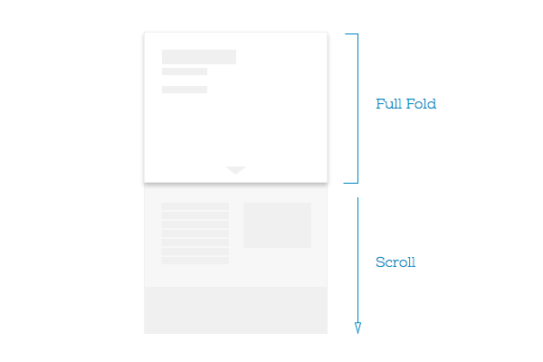
You’ve probably seen many of them recently: it’s a page where there’s a first block that perfectly aligns to your browser screen size, both in with and height, but then you can scroll it beyond that area.
The code to do this is simple (check an example here):
html, body, #full-to-fold {
    height: 100%;
}
This CSS allows the block with the id `full-to-fold` to extend to full height. Works on all the browsers (it’s an old trick), including mobile ones.
The idea of the FFS approach is that you have full control on what the users sees right when opens that page, while at the same time retaining all the advantages of having a naturally scrolling page without gimmicks.
This of course combines really well with the usual responsive approaches too: while they control often the structure based on width, you can adapt the design also to the height of the view.
Having this control means also that you have to guide the user to scroll, because it’s not self evident, adding something that becomes part of the above the fold design. This is the only constraint you get by using this simple technique.
Or… what’s beautiful about this approach is that you can actually use it also to do the exact opposite of a “Full to Fold”: if you set the height to be less than 100% you have the rest of the page to appear always right where you want it to be, cut exactly where you want it to be cut, thus suggesting automatically that there’s more to see.