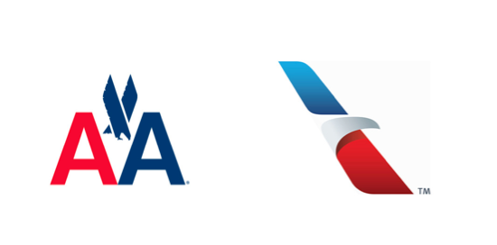
Brand New gave not one, but two articles to this historical rebranding operation. It’s significative because the first one was made by Vignelli and was not only part of the history of design, but also a quite effective one. Today, the redesign by Futurebrands creates what is one of the most clever marks I’ve recently seen: perfect execution, a positive/negative play, the colours of the flag, the eagle, the stylized A.
Unfortunatley, this in my opinion makes also an excellent example of the difference between a mark that sustains an identity and one that wash it away.
The reason can be expressed in any way, but I think that an example explains it better: the new one resembles too much British Airways and AirFrance.
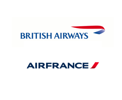 You can see clearly the trend of these. All of them are curvy lines in red and blue. You could probably start thinking they were the same company in different nations.
That’s surprising, because you would have expected that neither the client or the designer would have moved forward with something evoking something too similar to something made by another company. But that’s exactly what happened.
The execution is perfect.
The strategy isn’t.
UPDATE
As it should have been expected, they interviewed Massimo Vignelli about it. I will highlight two things.
There were no other logos then that were two colors of the same word. We took the space away, made one word, and split it again by color. It looked great. The typeface was great. We proceeded by logic, not emotion. Not trends and fashions. […] Design is much more profound. Styling is very much emotional. Good design isn’t—it’s good forever.
In different words, this is exactly what I said above. Vignelli’s mark has two characteristics: it is unique and it is timeless. It lasted 45 years and it could have been still used with just a refresh of the coordinated image.
This is the typical mistake that company presidents make: “I’ll change the logo, and the company will look new.” […] As you know, one of the great things about American Airlines was that the planes were unpainted. The paint adds so much weight that that brings an incredible amount of fuel consumption. For some reason they decided to paint the plane. The fact is, weight is weight. […] The whole world knows it, and there’s a tremendous equity.
This is part of the strategy I was speaking about. The previous logo was an amazing asset. Unique. Timeless. Strongly associated in the mind of millions of people worldwide. And curated to the point that they decided to create an unpainted plane that looked good. This is true design, something that goes deep.
Read the full interview, Vignelli is spot on also on the business and strategic problem of the new logo. Spot on.